
Air Quality Sensing and
Neighborhood Health Analysis
Tools: Kepler.gl/Mapbox, Python(pandas, numpy, seaborn), R, sklearn, Tableau,
Data sources: Array of Things (28 Million+ samples taken in October 2019), Chicago Health Atlas (2017 data), Walkscore.com API

Concentration of ozone pollutant as measured by limited Array of Things Sensors at a given hour.
Overview
This research examines the relationship between walkability, pollutant concentrations and zip code demographics (median area income, asthma related hospital visits for individuals under 18 years old) in Chicago. The analysis focuses on answering the following questions:
Do more walkable areas have different pollutant levels than less walkable areas?
Is median area income an indicator of community health and asthma related hospital visits?
How do pollutant levels vary by time of day and location?
Are there differences in the ozone levels between weekdays and weekends?
This analysis looks at a range of air quality sensors recorded by Array of Things and focuses a more in depth analysis on ozone concentration. ‘Ozone is one of the six common air pollutants identified in the Clean Air Act...It is created by chemical reactions between oxides of nitrogen (NOx) and volatile organic compounds (VOC). This happens when pollutants emitted by cars, power plants, industrial boilers, refineries, chemical plants, and other sources chemically react in the presence of sunlight’(EPA). Of the pollutants measured by AoT, Ozone was among the highest compared to the National max 8 hour average parts per million. In additional to negative environmental effects, ‘Breathing ozone can trigger a variety of health problems.’ (EPA)
Methods
Step 1 - Data Collection: Requests were made to the Walk Score (WS) API inputting the required parameters (URL address, lat+long, API key) based on the available coordinates from Array of Things (AoT), which was acquired off the project’s website. Demographic data was acquired from Chicago Health Atlas.
Step 2 - Data Wrangling: Two separate analyses were conducted using R and python. The WS, AoT, Chicago Health Atlas and shapefile data were all joined into one table based on common lat/lon/zipcode values. Walkability groups were created based on walk scores based on a normal distribution. For some analytical methods, values were normalized with a z-score.
Step 3 - Data Exploration and Visualizations: A normalized correlation matrix, box plots, line graphs, scatter plots and spatial maps were produced to address the aforementioned questions. Additionally, a k-means cluster was produced (not included here) to reveal similarities between different zip codes.
Data Sample
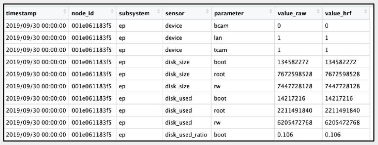
Array of Things node sensor data sample
+

Walkscore.com API request sample

Joined Array of Things node sensor and Walkscore.com data
Exploratory Data Analysis

Interpretation: 1) The correlation matrix reveals a high negative correlation between median area income and asthma related mean crude rate* (-67%) and number of hospital visits (-81%) . In other words, the lower the income, the higher the number of hospital visits. 2) Keeping in mind the limited number of zip codes analyzed, based on the amount of nodes available from AoT, the matrix reveals that there is also a correlation between lat/lon location and hospital visits. Specifically, zip codes in South East Chicago are at higher risk of asthma related issues than zip codes in North West Chicago. 3) On the other hand, the data does not show a significant correlation between walk score and air pollutants; and doesn’t show a correlation between air pollutants and asthma related hospital visits. Median area income, therefore remains the biggest indicator of asthma related hospital visits given the data sample.
*The mean crude rate refers to the ‘total number of asthma ED visits among children under the age of 18 years divided by the total population during a specified year expressed as visits per 10,000 population.’
Crude Rate by Zip Code

This map inputs the mean crude rate by zip code to reaffirm the correlation matrix finding that zip codes in the South East Chicago have a higher proportion of asthma related hospital visits than North West Chicago. I will emphasize that there isn’t an abundant amount of different zipcodes in this datatset, based on where nodes have been placed, however this initial study suggest a meaningful trend that is worth diving into deeper as more AoT node datasets become available.
Median Income by Zip Code

When compared with the mean crude rate map, this map of median income by zip code reveals the inverse relationship/correlation between income and hospitalizations. The areas with the highest income have the lowest proportion of hospitalizations and vice versa.
Ozone Concentrations in Chicago as Measure by Array of Things Sensors
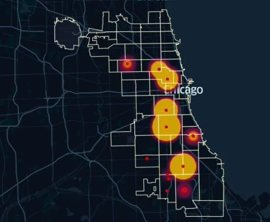
I created this timelapse using Kepler.gl. It reveals areas with higher concentrations of pollutants that also linger and sustain for longer periods of time. Areas in North West Chicago see ebbs and flows of low-level concentrations, while South East Chicago sees sustained concentrations.

Interpretation: Monday and Thursday see the highest ozone concentrations for the given week. Friday and the weekend have lower median concentrations relative to week days.

Interpretation: The box plot reinforces what we saw in the correlation matrix and median income map, which is that the areas with the lowest income tend to have higher crude rates.

Interpretation: There does not appear to be a significant relationship between the walk score of an area and the pollution concentration. The scatter plot (not included) revealed less of a correlation. Additional nodes and data points would be needed for more conclusive evidence.
Sample Context
Initial analysis conducted with Jen Foran

Two relatively high median ozone concentrations were found in the South East Side of Chicago. Node one (label 1 in the map and highlighted yellow) is located adjacent to a major highway, route 94 and the Red Line. Node 2 is located at a busy intersection at the center of a shopping area near residences and bus routes.

Next Steps:
AoT has introduced car and pedestrian sensors into their nodes, however, they are not yet calibrated/active as of this writing. This additional dataset would be insightful for understanding both walkability and car emissions.
This analysis was limited to 28 million entries and 16 nodes. A broader time frame with more entries could potentially result in additional insights.
The 16 available nodes with air quality data captured a limited number of zip codes. As additional node data becomes available we will be able to see a bigger picture of demographic trends.
Key Takeaway: There is a clear correlation between the median area income and asthma related hospital visits. Of the zip codes analysed, South East Chicago revealed areas with lower incomes and higher hospital visits. These areas also revealed pollutant concentrations that sustained over a longer period of time, although there is no clear correlation between ozone levels and hospitalizations. Additional nodes/zipcodes should be included in future analyses as data becomes available in order to verify these initial findings.